Jump to content

Favourite album cover?


Fabiolous
 Share

Favourite Album cover?  

123 members voted

  1. 1. What's your favourite album cover?


This poll is closed to new votes

  • Please sign in or register to vote in this poll.
  • Poll closed on 07/22/2022 at 02:06 AM

Recommended Posts

3 minutes ago, Ayham said:

Lol seriously for that movie… 🥲🤣🤣💀

The movie didn't turn out to be that good in the end but I get why she found the script interesting and wanted to do it. Also, it was 1999, her last movie had been "Evita" in 1996, a couple of other movie projects she had didn't happen and I understand she didn't want to lose her movie career after all the good reviews and success of "Evita".

We know what happened after with that...

Link to comment
Share on other sites

11 minutes ago, Prayer said:

The movie didn't turn out to be that good in the end but I get why she found the script interesting and wanted to do it. Also, it was 1999, her last movie had been "Evita" in 1996, a couple of other movie projects she had didn't happen and I understand she didn't want to lose her movie career after all the good reviews and success of "Evita".

We know what happened after with that...

Wow… from Evita to that movie. 😬 ROL would have been a TOUR to remember! I’m just imagining the intro or her singing SKIN live. 😮 I know DWT was something similar! 

Link to comment
Share on other sites

On 7/16/2022 at 4:01 AM, Ayham said:
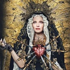
Madame X blonde cover shits on that ugly american horror movie sealed lips cover lol…
it’s actually a renaissance painting inspired art! It’s a shame we didn’t get a vinyl with this cover!

I’m not buying that theory, sorry. Nope.

The blonde version looks like an after-thought.

Link to comment
Share on other sites

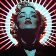
I like the AL cover but it´s not something like the ROL that I enjoy to look each time I have a chance. She was trying a che vibe on that but I did not really worked with her audience, maybe cause they want pop music, maybe cause it did not feel authentic..anyway, it´s a cover more, whereas the true blue one or rol one are pure icon on itself.

Link to comment
Share on other sites

On 7/17/2022 at 5:04 PM, Fabiolous said:
It's a pretty bad representation of the mood of the album. It makes it look super political when it's actually not at all

It’s a pop album. There’s no need to take it so literally.

Plus, it's a pretty fierce piece of graphic design.

Link to comment
Share on other sites

15 minutes ago, Drownedboy said:

I like the AL cover but it´s not something like the ROL that I enjoy to look each time I have a chance. She was trying a che vibe on that but I did not really worked with her audience, maybe cause they want pop music, maybe cause it did not feel authentic..anyway, it´s a cover more, whereas the true blue one or rol one are pure icon on itself.

It's just less 'beautiful' than those is what I'm hearing, essentially.

Link to comment
Share on other sites

Madonna's special posture that makes her appear like a statue in True Blue or her enigmatic look in Ray of Light were the reasons why these two covers caught my attention at the time. But in the end I decided to vote for Rebel Heart because I still can't find the meaning of what Madonna wanted to express with the cover art.

300y689.jpg.cb63b3ae3b450b3a2d687fcd89348ddf.jpg

On the one hand, perhaps the ropes represent the oppression of freedom of expression suffered by people in some societies, especially towards those people who are branded as rebels because their actions or opinions go against what is established. And on the other hand, the look of Madonna, so inexpressive that it reminds me of the look of a corpse, which is precisely what these people become, since being prohibited from doing or expressing what they feel, they end up becoming lifeless beings, heartless, limited to acting all their lives like automatons according to the norms of the society in which they had to live.

Link to comment
Share on other sites

On 7/17/2022 at 3:33 PM, Fabiolous said:

Actually this was the very 1st official image released from the project, in something from Warner in Japan, if I remember correctly? A website or some new releases plan or something like that. But later it wasn’t used anywhere 

Maybe it was considered for the cover at some point and that’s why Warner Japan got it?

Link to comment
Share on other sites

1 hour ago, Prayer said:

Actually this was the very 1st official image released from the project, in something from Warner in Japan, if I remember correctly? A website or some new releases plan or something like that. But later it wasn’t used anywhere 

Maybe it was considered for the cover at some point and that’s why Warner Japan got it?

So it wasn't the picture was photographed holding? I think it was 

Link to comment
Share on other sites

2 hours ago, Prayer said:

Actually this was the very 1st official image released from the project, in something from Warner in Japan, if I remember correctly? A website or some new releases plan or something like that. But later it wasn’t used anywhere 

Maybe it was considered for the cover at some point and that’s why Warner Japan got it?


23 minutes ago, Fabiolous said:

So it wasn't the picture was photographed holding? I think it was 

What @Vasiliis referring to is a pap shot of M holding a print out of a work in progress COADf cover. It was basically the same exact released cover, however it looked like pink and blue lights were shining down onto Madonna. The red hair was very toned down. I wish I could find the photo. Robster even recreated a drawing of it

Link to comment
Share on other sites

Hard Candy, even though I was appalled when I first saw it esp since coming off Confessions which was my favorite cover prior. If you were to pick one cover that really captures what Madonna is all about, I think it's Hard Candy that's why it's my favorite. It's just quintessential HER.

I don't know why ppl love True Blue so much. It's good but so many are better imo.

Link to comment
Share on other sites

6 hours ago, Nahual said:

How is Erotica in 2nd place? The cover is just a bluish outline of her eyes, nose and mouth. :dead:

True Blue looks great, but I had to go with COADF even though that pose looks awkward ICONIC

THIS. Except I fixed the last word for you :kiss2:

Link to comment
Share on other sites

Join the conversation

You can post now and register later. If you have an account, sign in now to post with your account.

Guest
Write here...

×   Pasted as rich text.   Restore formatting

  Only 75 emoji are allowed.

×   Your link has been automatically embedded.   Display as a link instead

×   Your previous content has been restored.   Clear editor

×   You cannot paste images directly. Upload or insert images from URL.

 Share

×
×
  • Create New...

Important Information

Terms of Use