Jump to content

Every Madonna Album cover ranked by Billboard


Recommended Posts

1 hour ago, WokeUpInMedellin said:

I loved reading their thought into each album cover! I was shocked by the top 3 though, I don't think I'd put any of them in my top 3 photographs gracing the cover of her albums.

My album cover chart would be completely different, too. But I agree with Hard Candy being at the very bottom of the list, at least. There is some justice in this world! :Madonna018:

Link to comment
Share on other sites

1 hour ago, LivingfForVogue said:

Where is I'm Breathless? And why is this album still defined as a soundtrack?

I totally agree. Even though I deemed it a bore when it first came out, in retrospect I think it was the last time she sounded fun and natural. From then on she lost that quality in her voice.

Link to comment
Share on other sites

1 hour ago, EgoRod said:

Dissing Hard Candy for looking like a blotched photshop job and putting CODF on the top. along the best, better designed and more photographic cover.

That cover is whack. looks like a parody

The secret word is aesthetic.. In Hard Candy, there is none. Even a photo of 'boxing M-Dolla' doesn't really fit with pink candy theme. While COADF is absolutely consistent in terms of topic, colors etc. 

Link to comment
Share on other sites

33 minutes ago, maddy1111 said:

The secret word is aesthetic.. In Hard Candy, there is none. Even a photo of 'boxing M-Dolla' doesn't really fit with pink candy theme. While COADF is absolutely consistent in terms of topic, colors etc. 

I disagree , while Hard Candy the concept is as corny as a dad joke. With CODF the whole concept is dated and so 2000 amateur graphic designer job. I remember discussing it in the forum before and went down investigating and is the same guy that did I believe rebel Heart and MDNA design.

Bedtime stories is far more interesting and better put together.

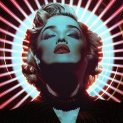
The typefonts are an interesting choice, using a modern style font,  with an attempt of neon effect (just go into layer styles and add glow) matching with a cursive handwritten. Adding a 3D element of a globe that suppose to look like a disco ball. But is not a disco ball is a globe. None of the typefonts represent 70s or disco.

Background: an overlay gradient with pattern of circles that suppose to represent the disco ball reflecting, but they don't. They look like  a weird circle pattern from the 50s

Madonna cutout like a paper-doll and buttered up with a soft filter removing any shadows or lines and adding color over layers that make her hair and skin look like the coloured photos from the 20s. She even has a shadow over , from the title, because nothing cast more shadow than a neon light (?)

It's a mess from a visual graphic point of view. The photoshoot with Klein has lots of great photos and they used the lights and reflection so good.  Just to get them all wiped out and do that cover.

One of the photos with some profesional editing, keeping the disco lights contrast  and add some simple but retro typeface. Like from Studio 54. And you have a great, classy effective cover.

Link to comment
Share on other sites

The Hard Candy cover is what the music videos should have looked like. So bad it's good imo.

Bedtime Stories cover will always be the upside down pic for me. The right side up looks weird.

I'll never forget seeing the ROL cover bills wheat pasted all over NYC when it was being rolled out. She looked like a magical goddess. What a time.

Link to comment
Share on other sites

Join the conversation

You can post now and register later. If you have an account, sign in now to post with your account.

Guest
Write here...

×   Pasted as rich text.   Restore formatting

  Only 75 emoji are allowed.

×   Your link has been automatically embedded.   Display as a link instead

×   Your previous content has been restored.   Clear editor

×   You cannot paste images directly. Upload or insert images from URL.

 Share

×
×
  • Create New...

Important Information

Terms of Use